- How to Grow a SaaS (Software) Business FAST - February 10, 2025
- 6 Advanced SEO Tips to Dominate the Search Rankings in 2025: Informed by Our Biggest Clients - January 17, 2025
- 7 Advanced Tips for Companies Spending $1M+ on Google Ads - December 10, 2024
There are over 7 million active Facebook advertisers.
Everyone from small businesses to Fortune 100 companies are running ads on Facebook and Instagram.
That’s because with over 2.9 billion active users on Facebook, it remains one of the most scalable growth marketing channels.
And while it’s become more competitive (read: expensive) to run Facebook ads, making profitable campaigns isn’t rocket science. It’s all about testing and optimization.
If you want to get optimal results on Facebook, you should test everything from the audience to the ad copy to the landing page. This post is about how to optimize your ad performance with incredible Facebook landing pages.
Table of Contents
What is a Facebook Landing Page?
A Facebook landing page performs the same function as every other landing page: it makes a visitor take action. It compels fans to donate, or buy, or sign up for a newsletter. Facebook landing pages can be published on your own domain or on Facebook’s platform itself.
I’ve run Facebook ads for 5+ years.
I’ve worked with companies spending a couple hundred dollars/month and ones spending hundreds of thousands of dollars/month.
There are a number of reasons Facebook ad campaigns don’t succeed.
But I’ve consistently found that entrepreneurs and marketers fall short in one key way: landing pages.
Most Facebook advertisers spend time:
- Changing audiences
- Scouring for new images/carousels/videos
- Optimizing for placement — open targeting, mobile/desktop on Instagram, Facebook, Marketplace, etc.
- Slicing audiences with gender, age and layers of interest targeting
But if you’re forgetting to optimize your landing pages, you’re going to fall short of your Facebook advertising goals.
Think about how important a landing page is.
The landing page is the place you capture leads, or compel a user to buy, click, download or sign up.
It’s the proverbial whole enchilada.

You can’t afford not to invest time in creating high-converting landing pages.
The average landing page converts at 4.02%.
But that’s average.
The top decile of pages are converting at over 11% according to this WordStream study.
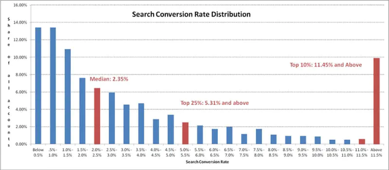
That means 10% of Facebook advertisers are making 5x more money than the average guy/gal.
Why shouldn’t you be that person?
Follow these tips and you will get much higher performance in the next Facebook ad campaign you run.
5 Best Practices and 10 of the Best Facebook Landing Pages
There are a number of important factors to consider when planning and designing an optimal Facebook landing page.
Of course, the better the landing page, the higher your conversion rate will be and the better your return on investment.
I’ve boiled down the steps to making a high-converting page to exactly 5.
- Use a strong value proposition
- Frame your value prop
- Consistent messaging
- Brevity is your friend
- A/B testing
Making a Great Facebook Landing Page In 5 Steps
1. The strong(est) value proposition
Stop and think about your potential customer/user for one second. They’re looking at cat memes and dodging articles about Trump on their newsfeed.
They’re not thinking about you or your product! When they click to your landing page, you have to grab their attention quickly. What do you want them to think and “feel” when they land on your page?
Everyone who hits your page wants to know “what’s in it for me?”
Make sure your page has a unique value proposition. It should catch a user’s attention because you literally have seconds to convert them.
Most people who land on web pages “screen and glean” and then leave. Give them a reason to stick around a while. If you’re using landing page software like Instapage or Unbounce, your value prop should be the first thing you A/B test on your landing page. In fact, for many pages this is the only thing I test.
When thinking about a value proposition, I like to channel one of my favorite books, Play Bigger. In Play Bigger, we learn to think about category design rather than just value propositions. While your company may not be the biggest player in your space, you have a unique value proposition that indeed makes you the biggest player in some space. Figure out what that is.
For instance, our tool GrowthBar isn’t the biggest SEO tool. That honor goes to recently IPO’d Semrush. But it is the best SEO tool for content creators and teams.
Be the biggest player in your space — however you define that space.
Use your headline to tell that story and capture readers.
Plus, your headline is one of the largest determinants of your ad’s quality score. Facebook wants their users’ experience to be great — consistent from ad to landing page. Advertisers who do this are rewarded with lower costs.
So creating a great value proposition is in Mark Zuckerberg’s best interest and ours.
2. Use an image that frames your call-to-action
Have you been to the Growth Marketing Pro homepage? Go ahead and check it out here.
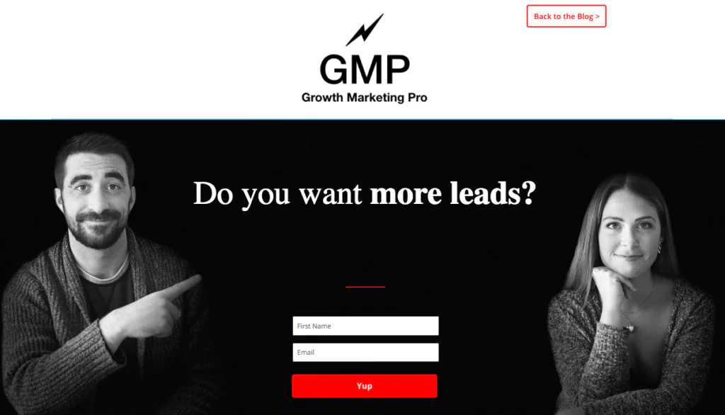
It’s not a coincidence I’m pointing to the CTA.
We’ve A/B tested, and this image converts 32% better than others.
Using the image to frame the call-to-action is an old trick, but one that still seems to work for most Facebook landing pages.
Simply choose an image that “looks” at your call-to-action.
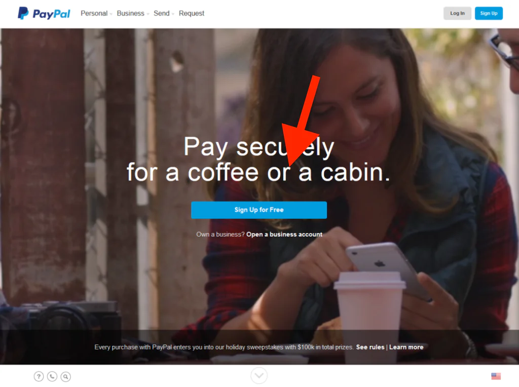
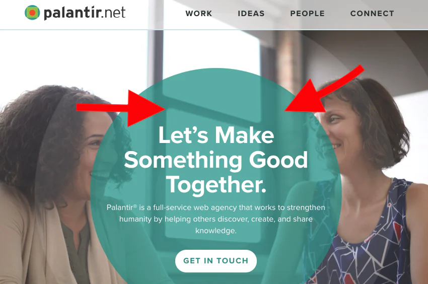
Plus, it’s stupid easy to implement. Change your image. Do it now!
3. Consistency of landing page message
The reason a consistent message is important for a few reasons:
- The user experience and sentiment about your brand will not be good if you sell something completely different than what you advertise. If you’re selling a hair loss product your users should actually see a landing page that refers to “hair loss.”
- Humans hate context switching. You want to make your landing page feel like a continuation of what the user was already doing. Your ad is a soundbite of your offering. Your landing page is the logical continuation of that soundbite that engages and rewards the user for clicking. On this note, it helps if your imagery is congruent from ad to landing page. In other words, if all your ads are green, choosing a color scheme on your landing page that is green.
- An important component of Facebook ad performance is quality score. The higher your quality score, the lower your ad cost CPMs and CPCs will be. One of the largest components of quality score is the relevance of the landing page to the user and ad.
I’ve found time and time again that the ad concept must match the landing page. Not only will this improve your conversion rate, but your quality score as well.
4. Brevity is your friend
Over 98% of Facebook activity is performed on a mobile device and this percentage continues to increase. That’s crazy, right?
How often do you scroll through multiple pages of anything on your phone?
I’ve now launched thousands of landing pages for Facebook campaigns. All things equal, shorter pages do better.
If you can tell your story in a concise way, you’re going to capture more leads. This is true on mobile and desktop.
Do not overwhelm the viewer with countless facts and figures at this stage.
While at a telemedicine company several years ago, we had incredible success with this PrEP (HIV prophylaxis drug) treatment program with this simple landing page.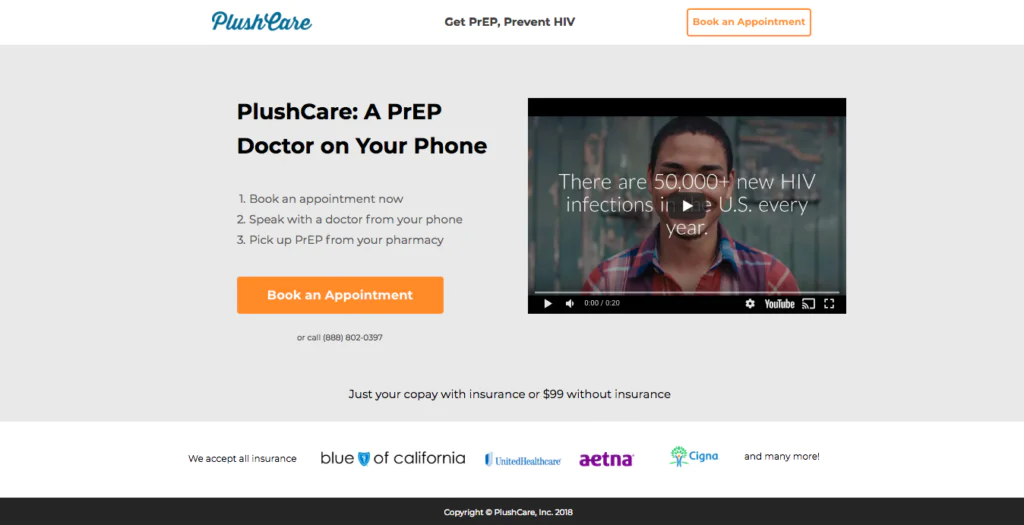
There’s nothing below the fold on desktop. On mobile, this renders in just a couple of frames.
By the way: this simple video was made using a rapid video making tool called Biteable. I highly recommend it!
If you’re using a landing page to collect contact information — keep your fill-in form short. Asking for more detail is enticing, but is likely to put a large percentage of people off. Most people are just not going to take the time and effort to give you the details you want to save it for a later stage in the funnel process.
For now, you want to grab their attention, keep it and get them to take the desired action.
5. A/B test
As with anything in digital marketing, you should always make sure to A/B test.
Facebook landing pages are no exception to this rule.
Once you’ve discovered a landing page that works well, you can definitely eek out another 10%+ performance just by a/b testing a few things on your page.
Below is the very simple dashboard Instapage uses to show you performance of your a/b variants.
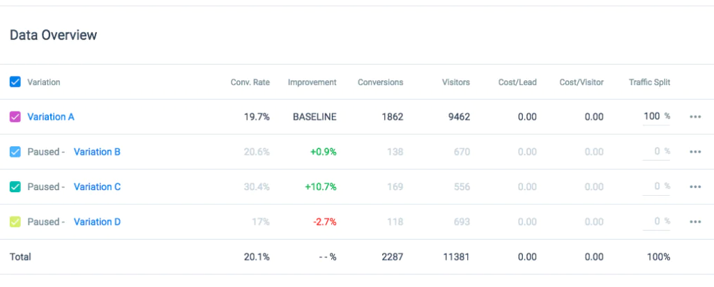
Usually, if I have a pretty solid page, the only things I will test are:
- The value proposition
- The hero image
- The length of the page (do I include a few extra value propositions or not)
While a/b testing is important, make sure to draw the line somewhere. You’ve got plenty of things you need to take care of to grow your business. Don’t spend 12 hours a day a/b testing!
Instapage, LeadPages, Unbounce and ClickFunnels — the big 4 in landing page software — all have some form of a/b testing. So you know it’s important.
The 10 Best Facebook Landing Pages
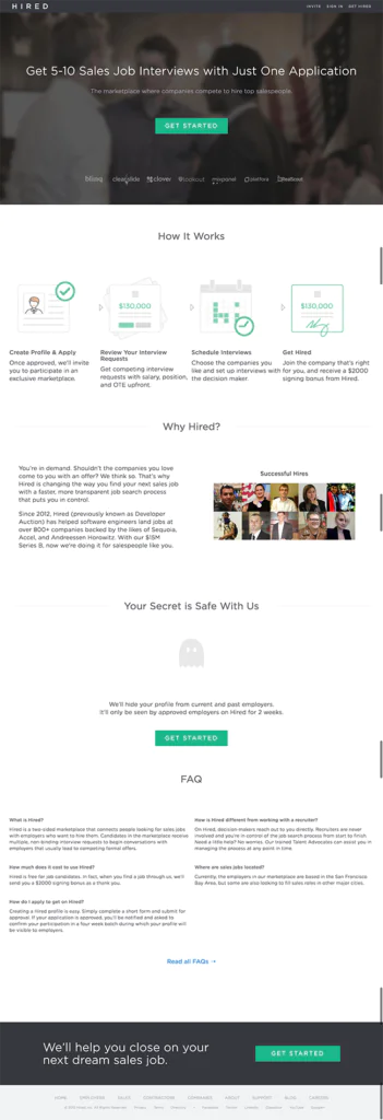
1. Hired
What I like:
- The value proposition is so strong. In under a sentence, Hired has let me know that I can not only get an interview by signing up. But I might get up to 10!
- Social proof badges: you can see at the bottom of the hero image, there are logos of the companies Hired works with. Some of them are very legitimate technology companies!
- There are multiple CTAs in the form of big green “GET STARTED” buttons.
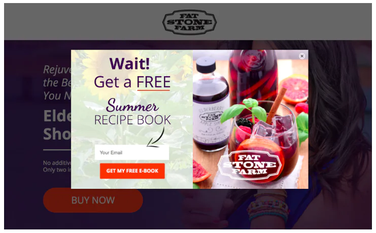
2. Fat Stone Farm
What I like:
- The girl in the image is looking at the CTA, which is a big old “BUY NOW” button.
- The popup modal: this “Summer Recipe Book” email capture gizmo is great. I almost always ad “exit intent” popups on my landing pages. Exit intent popups are the ones that magically appear as you’re about to leave the page. They’re annoying and they generally convert an extra 5%+ of users! Use a tool like Hellobar to make them yourself.
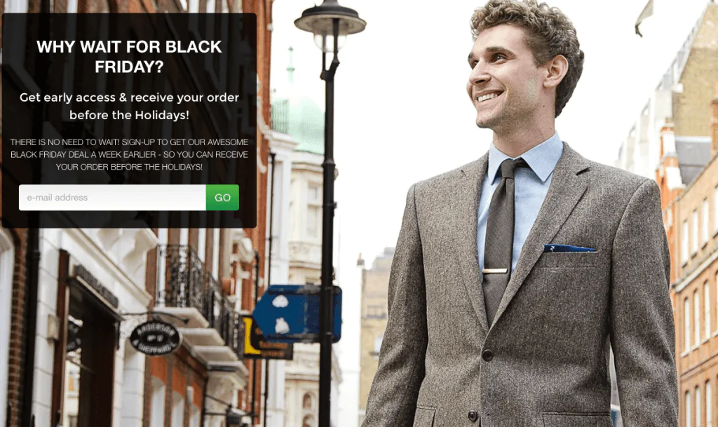
3. One of the million suiting companies
What I like:
- The chap is looking at the CTA, which draws my eyes to it.
- The CTA (an email capture) really stands out on the page.
- The offer is very compelling: you mean if I give you my email you’ll sell me something sooner rather than later?! Yup.
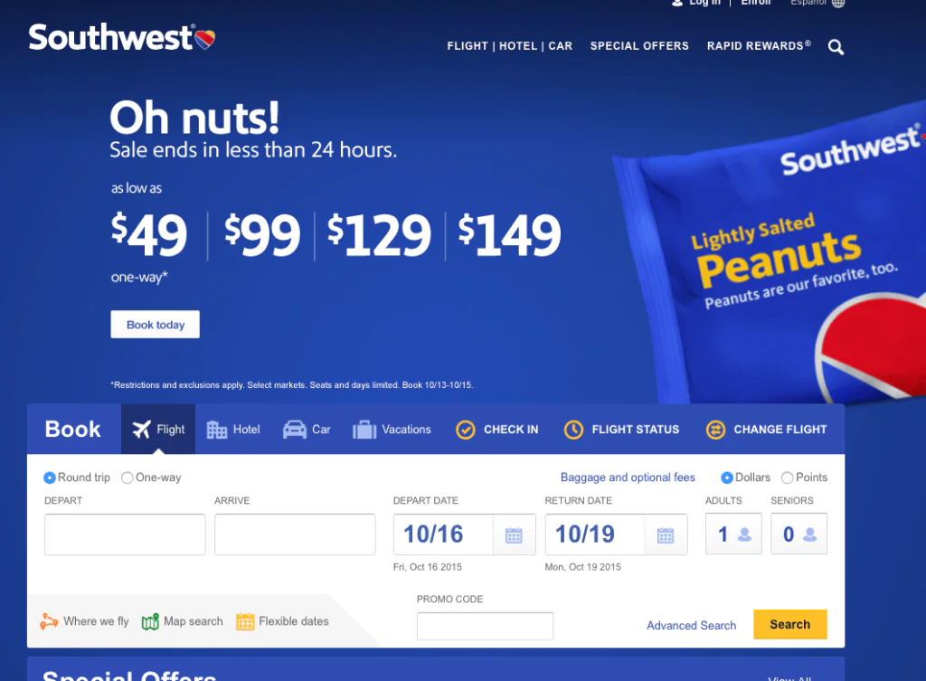
4. Southwest Airlines
What I like:
- They make the most important information the boldest and biggest.
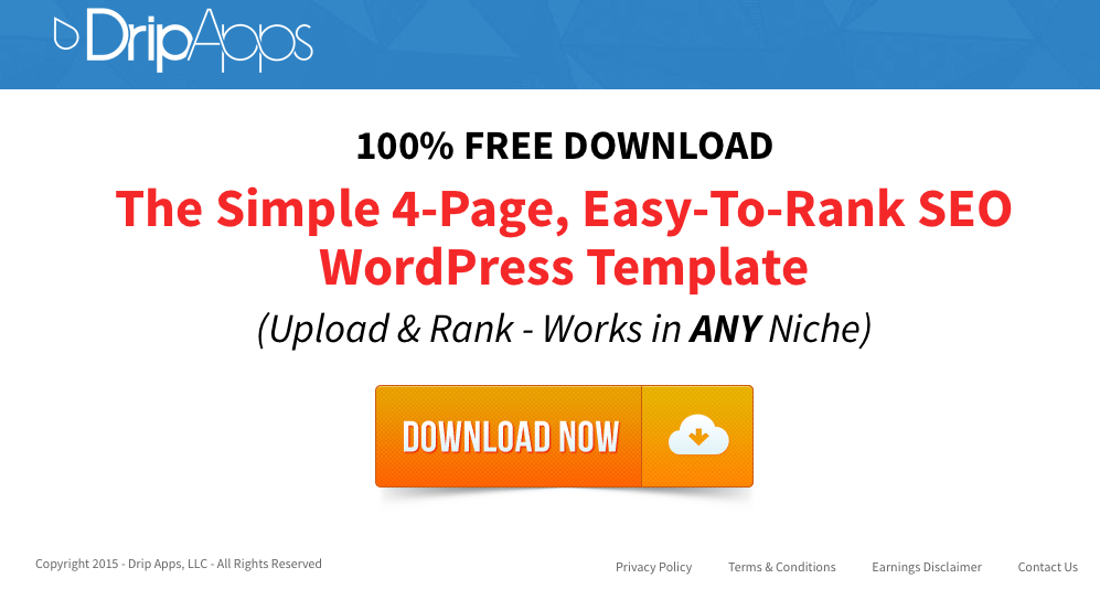
5. DripApps
What I like:
- I’m telling you: pages that are stupid simple like this one convert. Of course, you should A/B test to be sure of it.
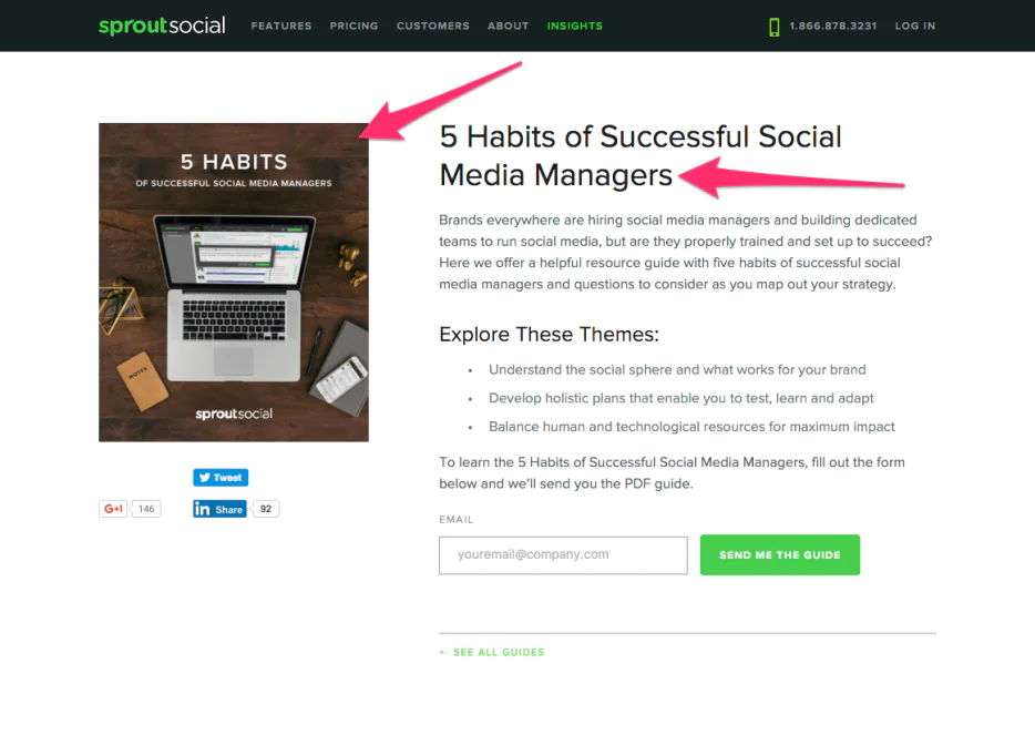
6. Sprout Social
What I like:
- Great, big, heroic email capture + “SEND ME THE GUIDE” CTA button.
- They use bullets to get information across in bite-size chunks. Bullets are good.
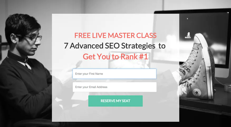
7. MasterClass
What I like:
- This hip fella is looking right at the CTA.
- The CTA is crystal clear. They condensed a lot of information into under 15 words.
- “Reserve my seat” CTA connotes scarcity, which generally causes users to take immediate action.
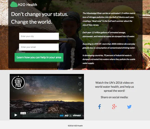
8. H2O Health
What I like:
- H2O Health uses a compelling hero image of two girls in the developing world. I’m already beginning to understand what H2O health does simply by looking at the image.
- H2O health has an awesome and eye catching video. To a Facebook passerby, this is valuable content. Maybe it’s worth staying on this page a bit longer…
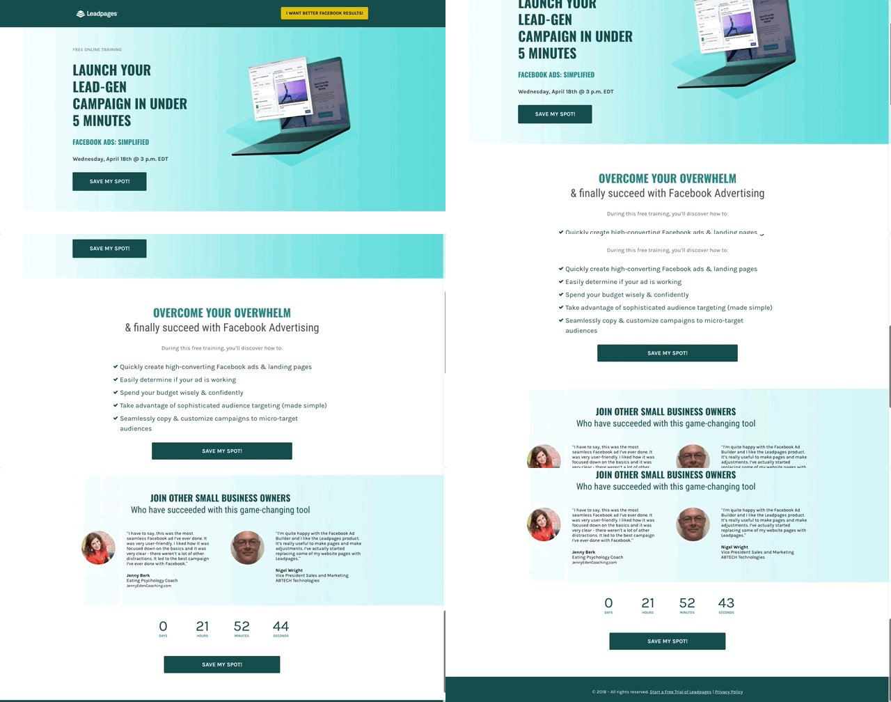
9. LeadPages
Please note, this image is a gif of the entire LeadPages homepage.
What I like:
- It’s a little long but it has the most important information. 1) A hero image and CTA 2) Bullets describing “what’s in it for me” 3) Two customer testimonials 4) A countdown clock telling you to “Save My Spot.” Mic drop.
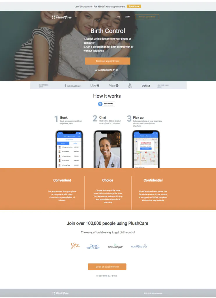
10. PlushCare
What I like:
- The hero image is very eye catching. The gal in the middle is looking straight at the user.
- There are social proof logos on the page galore! First, there are the insurance logos of every insurer PlushCare accepts. Then, the user knows their doctors and data are all HIPAA compliant with a badge at the middle of the page. Finally, they see the name brand birth controls that PlushCare will write prescriptions for.
- We too use Hellobar to make one more CTA at the very top. The section that says “Use ‘birthcontrol’ for $30 Off Your Appointment” is a fixed header that follows the user as they scroll down the page.
Final Thoughts on Facebook Landing Pages
Facebook is a massive platform that is extremely popular and provides a great opportunity to reach and engage with your target market.
It is far too big to be ignored and has to be an important element of your overall online marketing strategy. To ignore it would mean missing out on a large percentage of potential customers.
A quality landing page is a key element to any efforts made in Facebook advertising and without a good landing page, your money and efforts will be wasted.
While the basics are fairly simple, there is an art to creating a good Facebook landing page.
Spend the time and ye’ shall be rewarded.

Hi i whant to build a contact form to advertise on facebook … to put in a picture and when they clic on it a pop up comes so they can put their name city and phone number with email so i can communicate with them later on…i’m in the insulation business i offer free inspection of their attic to offer my services for decontamination and insulation 😉 i have a website that i did myself but the contact form doesnt work loll …. https://isolation-solutions.ca/
Wow, nice informative information of landing pages for a Facebook Advertising campaign you have explained very simple and easy to understand it helps me lot.
Thank you so much
Your article is so nice, thanks for sharing this information. I have got a lot of information on this article, really it will help my business.
This is a great information you have share, As I’m newbie into Blogging, it can surely make a difference. Thank you so much