- How to Grow a SaaS (Software) Business FAST - February 10, 2025
- 6 Advanced SEO Tips to Dominate the Search Rankings in 2025: Informed by Our Biggest Clients - January 17, 2025
- 7 Advanced Tips for Companies Spending $1M+ on Google Ads - December 10, 2024
Landing pages are critical to the success of any online campaign.
Also called landers, lead capture pages, squeeze page or splash page — landing pages do a lot for digital marketers and entrepreneurs.
The modern marketer needs landing pages to:
- Attract and convert leads
- Run paid campaigns through Facebook, Google Ads, etc.
- Get users interested in a live event or webinar
- Nurture users with content
- Or simply to delight users with more information about the product or service.
Five or 10 years ago, before landing page builders, it was difficult to get webpages to look and feel usable and clean. Pages were rigid and downright ugly. Plus, the simplest changes required developers to make edits in code.
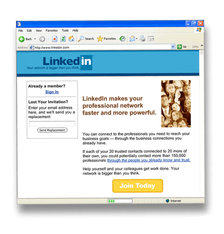
Now, you can simply drag and drop pages, add lead capture forms, change images, A/B test and a do a million other customizable things with your webpages.
Companies like WordPress have democratized the whole process of creating a blog or website. And tools like Unbounce and Instapage have made it possible to create landing pages in a drag-and-drop fashion, so pages look exactly as you envision them in your mind’s eye.

Making landing pages isn’t that difficult. There’s a ton of best practices and most of them are easy to execute.
Plus, landing page software has made it easier than ever to get your visitors to take your desired action.
Better landing pages = higher conversion rate = more money!
Table of Contents
But First, Why Even Read this Post About Landing Page Optimization?
Conversion rate is the ratio of the number of visitors who take a desired action on a webpage over the total number of visitors.

Pro tip: To improve the click-through rate (CTR) on your links, you can use a custom short URL tool like Rebrandly. This tool lets you shorten, brand and track every link that you create and share. Using branded links can increase your CTR by up to 39%.
Landing page optimization is all about making incremental improvements that make your webpages more effective at converting users.
If you’re paying $100 in Facebook ads, it’d be much better if those ads yielded five customers instead of just one, agree?
Great landing pages give just enough information to pique a visitor’s interest and get them to sign up or take an action.
When more users taking your desired action on a page, you will earn more money.
Simply put, optimizing your landing pages is one of the lowest cost and easiest things you can do to increase your revenue without additional marketing spend.
Neil Patel offers an excellent example on his blog. Walmart’s Canadian division enlisted his landing page help to make more money. Before enlisting Neil, they were considering a whole host of other options including raising marketing spend and hiring a staff.
But Neil’s simple changes to Walmart Canada’s website — particularly in page load time and mobile design — yielded another $1.3M per month in revenue.
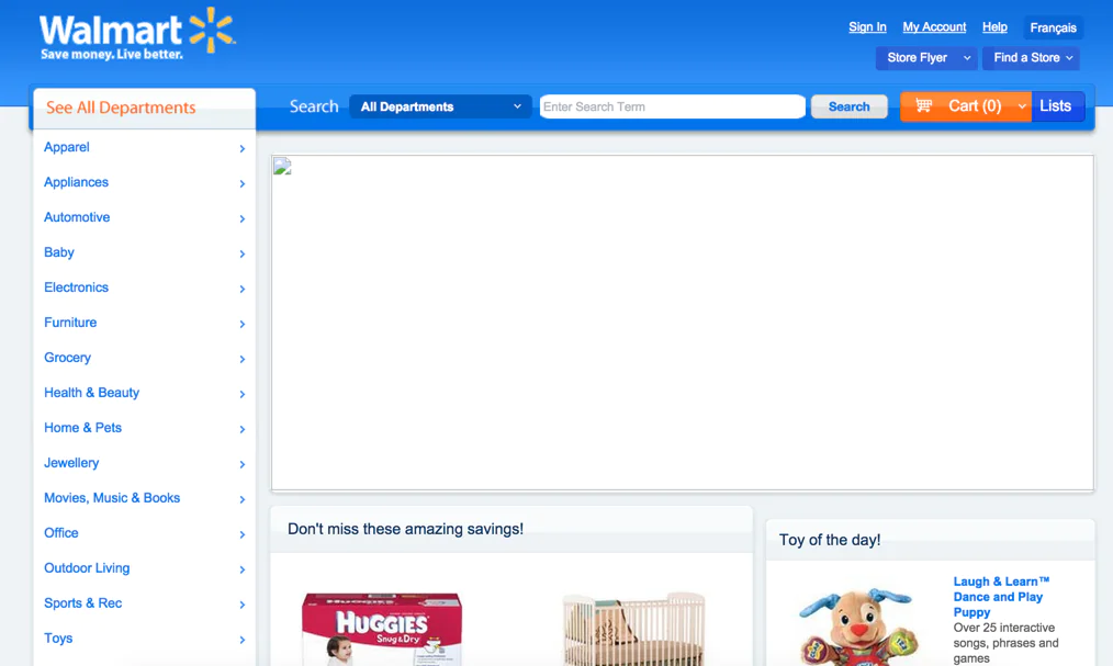
Landing pages are the lifeblood of your website.
Your webpages are your storefront. After all, how many people walk into a crummy looking store?
The 8 Best Ways to Optimize Your Landing Pages
There are a lot of things you can do to make landing pages that convert users. Having made literally thousands of landing pages, I’ve boiled it down to the 8 things you must do if you want to optimize your pages.
1. Product Marketing and Your Landing Page
Product marketing is as it sounds — how to market your product or service. Companies like Facebook, Google, Netflix and Amazon have scores, if not hundreds of product marketers. All of them are doing one thing: understanding and defining the customer.
The first thing your landing pages have to do is speak to your audience. You literally have to read the minds of your customers!
If the landing page serves first-time visitors, you’ll want to describe your brand and product offering in detail. However, if the page is geared at existing users, you can assume they already know that information and you’ll want to highlight other offerings.
Make sure your page speaks to who your user is and where they are in their purchasing journey.
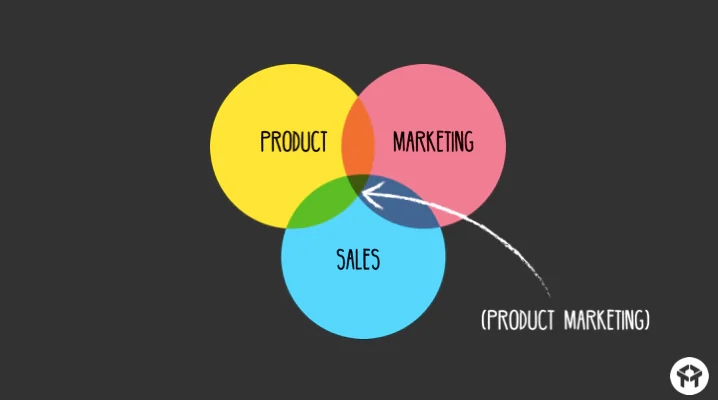
2. Look at What Others are Doing
I’m all for being creative and original, but there’s no question that others in your industry (or a similar industry) have created great landing pages that convert users.
It’s much easier to have a jump-off point. Plus, other companies have likely gone through many iterations of their landing pages to figure out which ones convert best.
Use their learnings for your benefit!
If you’re trying to really dig in, use a tool like SEMRush to spy on your competitors and see all the landing pages they’re running Google ads to.
Even easier: just Google your competitors and popuplar search terms in your industry and click on their ads. Voila, competitive research!
Remember, pages vary widely industry to industry. What works for a fintech company will be very different from a blog, which will be very different from an ecommerce company.
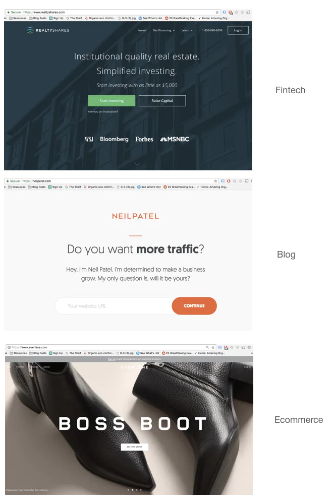
3. Give Users a Compelling Offer
Don’t give your visitors a choice — make them convert!
If the goal of your landing page is lead capture, you need to make sure you have an offer. “Get my newsletter” is simply not compelling enough.
The best landing pages are very simple and have a call-to-action that adds true value to the visitor.
Give them something free. Give them a customized journey based on their zip code. Give them a free consultation. Give them something!

4. Use Landing Page Software
If you’re using Shopify, Wix or some other drag-and-drop website creator, you have all the tools you need to start making landing pages right in the software. You can skip this section.
But many more of us have websites built on less user-friendly platforms. If your site was custom built by developers or is built on a CMS like Orchard, Drupal or WordPress, you’re probably facing a landing page crisis!

It’s impossible to publish pages that have a combination of video, images, call-to-action buttons, dynamic headlines, email capture fields and beautiful images. You have to choose one template or another and they never come out just right.
Use landing page software like Instapage. Instapage will let you make make perfect landing pages to capture leads, promote content, host webinars, convert users, etc.
Instapage’s magic is in its simplicity. Landing page software allows you to make high-converting landing pages in a minute or two.
Instapage features a drag-and-drop editor that allows the user to create and change page elements in real time.
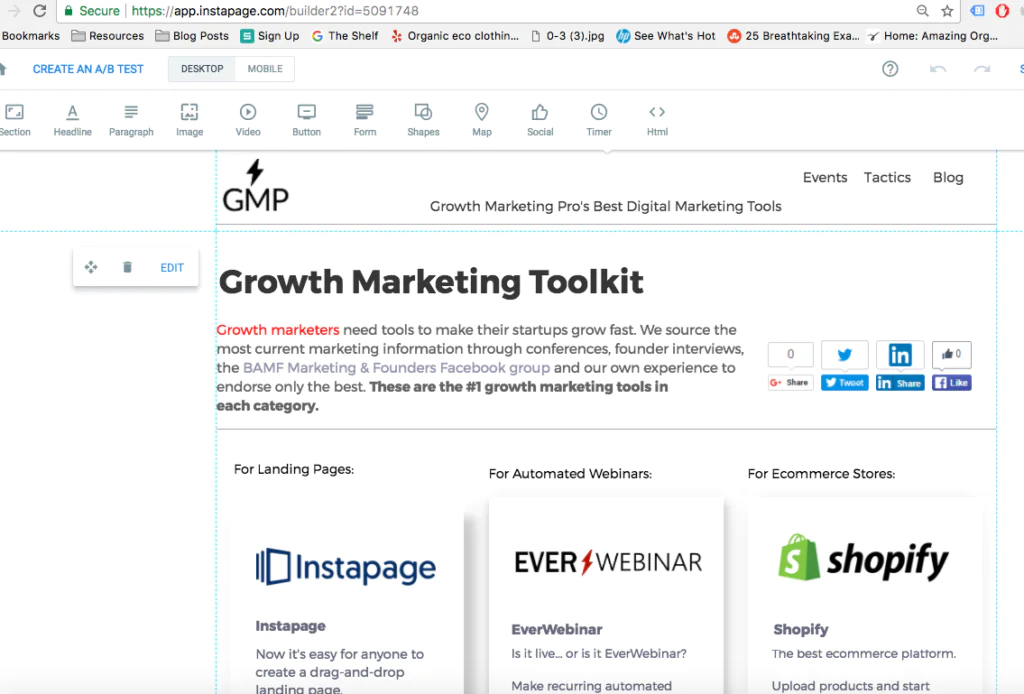
If you want to try Instapage, we have a 14 Day Free Trial.
5. Visuals
You have literally seconds to grab a user’s attention. One of the most powerful ways to ensure you do this is with great imagery.
Images need to:
- Contrast in color with the primary text
- Match your brand
- Draws the user toward your call-to-action
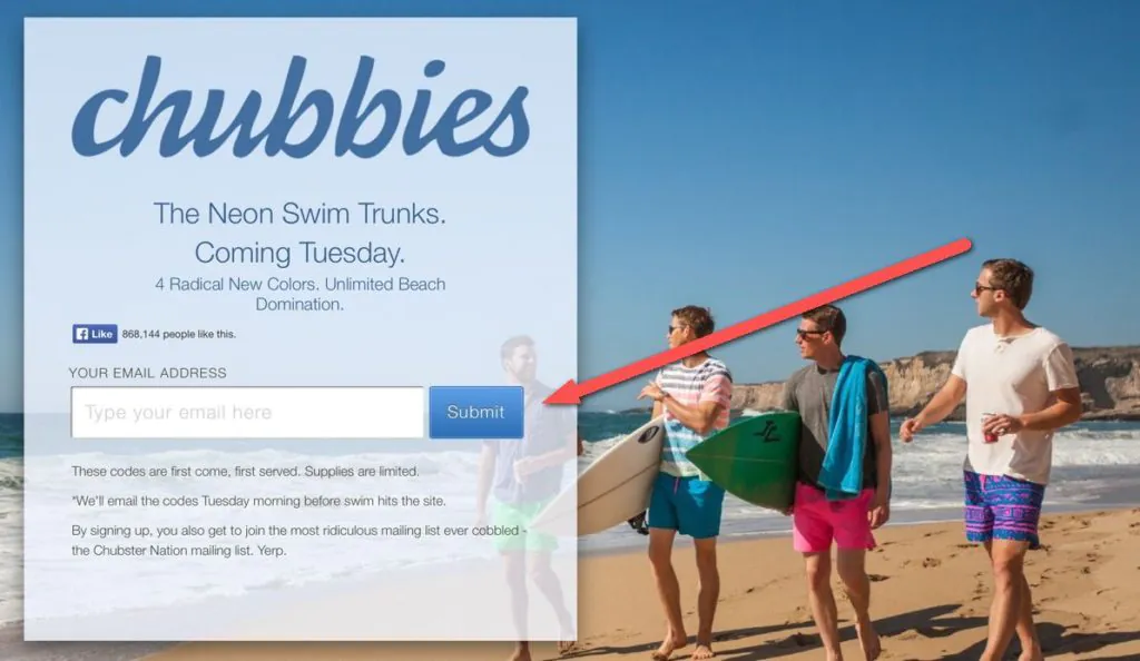
I often find that images in which the subject (human, kitten, etc.) is looking toward the call-to-action perform better than others. Give it a try yourself!
6. Social Proof
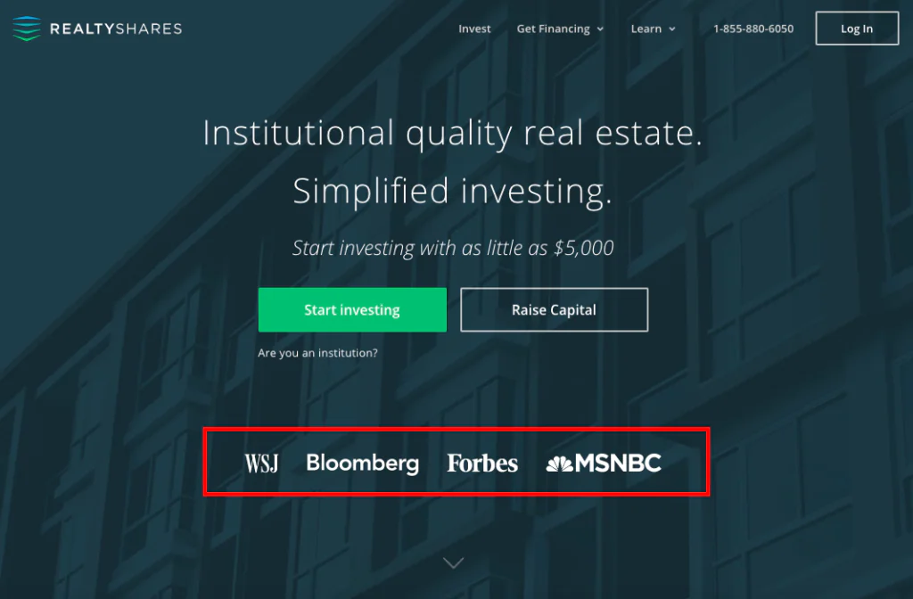
Have you ever noticed that every website brags about the press they’ve been featured in or how many customers love what they do?
This of course, is by design. Humans are trained to love badges, icons, Facebook +1’s and testimonials. They prove that others like the product. If others like it, shouldn’t I?
When we A/B/C/D tested the homepage for a consulting client of mine, keeping the press badges above the fold won every time.
Proof points like these prove your legitimacy to potential customers.
7. Collect Information, but Only as Much as You Need
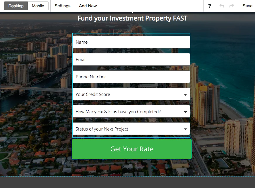
If you’re using landing pages to create forms for lead capture, make sure to gather only as much information as you need.
Every additional field you add reduces form completion by ~20%. Gather only what you and/or your sales team needs to nurture leads and nothing more.
8. A/B Test the Important Stuff
If you’re changing elements on your pages, it’s good to be scientific about it.
Use A/B testing to ensure that your elements are optimally placed to optimize performance.
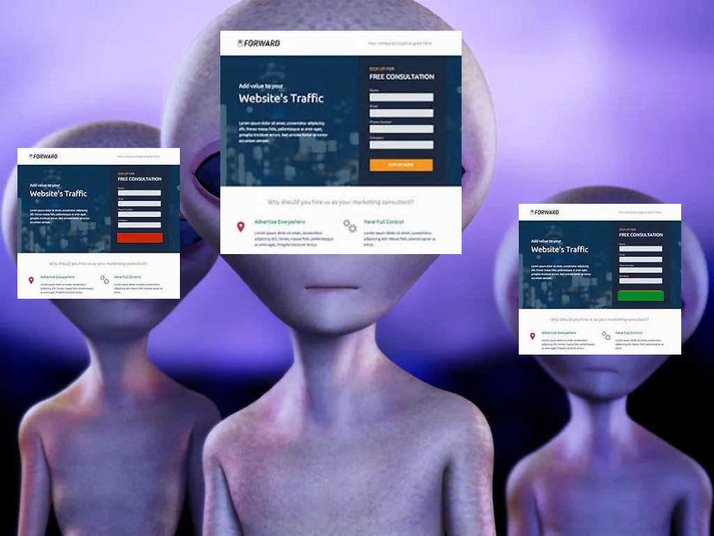
Most landing page generators like Instapage have A/B testing modes that allow you to make changes and test them against a control page.
But don’t go crazy — test important elements like your headlines, background image, call-to-action and lead capture form length.
Unless you want to spend all day tweaking landing pages, test only the important stuff.
Landing pages are awesome.
You’ll convert a ton more users if you follow my advice. I promise.
Here’s a bunch of other useful resources:
